Skyline Maintenance Services came to us with an existing brand and website design that had multiple challenges in terms of engagement and brand awareness. Among the many challenges: their logo was too generic to be memorable, and the website was not optimized to engage their target audience. You can see where they were at this stage below:
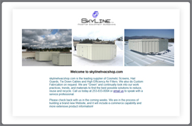 In addition to the design challenges, there were technological issues as well. The old site was running on a slow and unreliable server, leading to slow page loading times which negatively impacted their SEO efforts.
With a huge sense of urgency, we updated that website and brand to the one below:
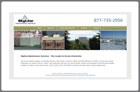 Fast forward to today. They are growing aggressively, taking on bigger and better clients, and broadening their market and services offered. With a new focus on growing their market share, it was time to start fresh.
The first step was to change the name of the company to be more in step with today’s focus. Skyline Maintenance Services became Skyline Mechanical, and it was time to begin the formal branding process.
The next step was to create buyer personas to identify who we were trying to attract and what we wanted the brand to convey to them. We then looked at their competition, and discussed the effectiveness of those brands.
Lastly, we looked at brands in other industries until we really understood what they were looking for, and what they wanted to communicate. That information was then used to create a brand blueprint that serves as a guide for our design team. The initial brand presentation is below:
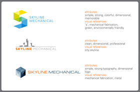 We talked through the attributes of each, and what our thought process was when creating. They fell in love with #1 and #3, and asked for a few tweaks to them. Below you will see the results of those tweaks:
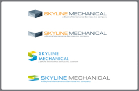 They fell in love with #2, and the brand was born. Here is a sample business card and electronic letterhead:
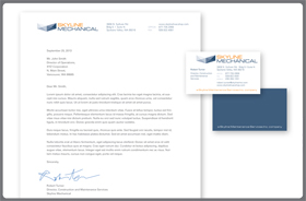 Now that the brand was solidified, it was time to start on the website design process. We looked at their top three competitors’ websites and discussed what they liked and disliked about each. We also asked more questions to better understand how they are positioned vs. those competitors, and what makes Skyline Mechanical remarkable and unique.
Lastly, we talked about their sales process, and what we wanted their buyer personas to do once they arrived at the website. Just like with the brand, we then created a design and development blueprint that leads our process. Here are the design concepts that were presented:
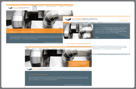 Typically at this stage we get comments such as I really like design concept 1, but prefer to have the phone number at the top. Or I really like design concept 3 but love the orange bar element on conept 2. In this situation, they loved #2 as is, and were ready to move forward. Next step was to select two more stock photography images to use, and then begin the coding.
The new site is now live! you may view it here:
